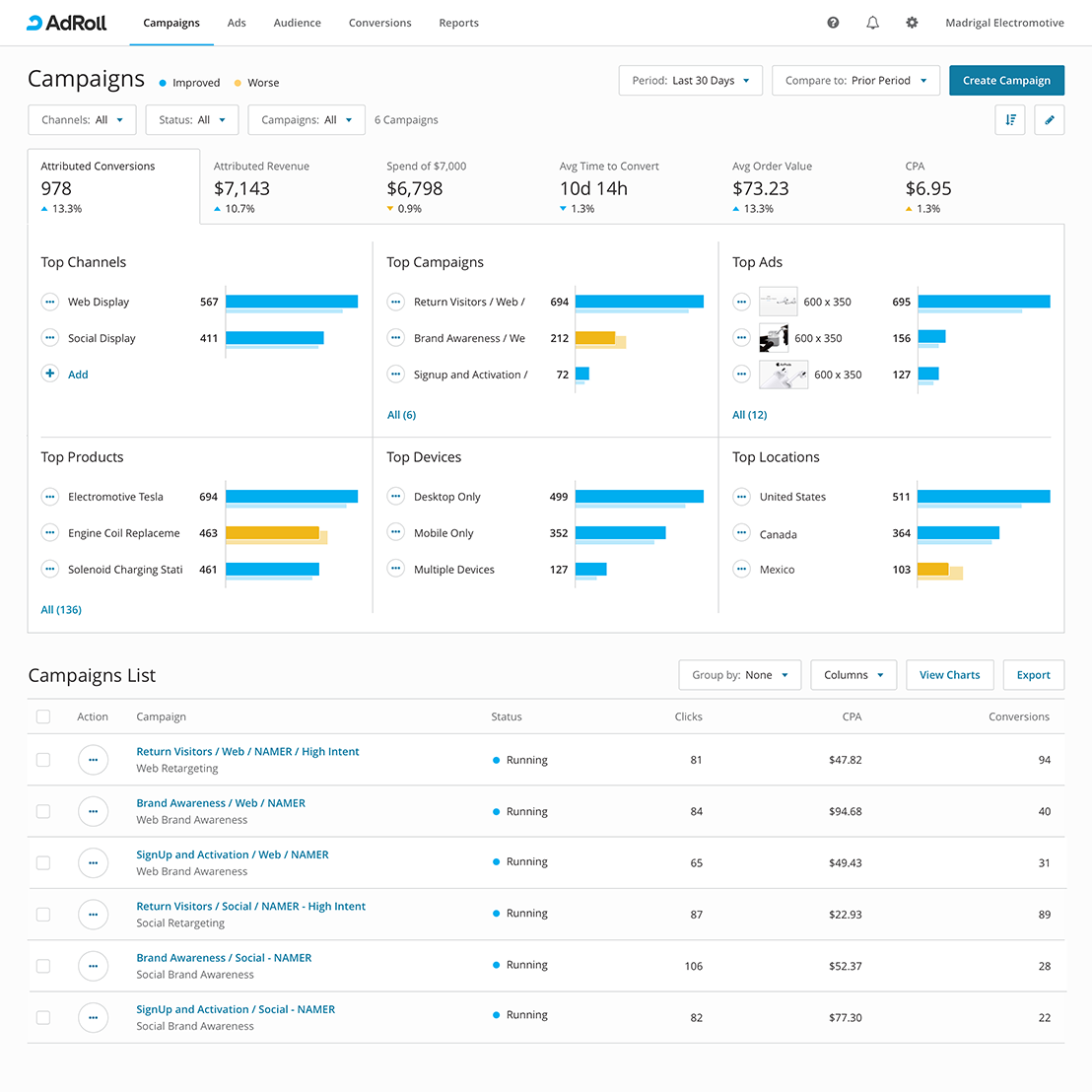
Campaigns Home
Empowering marketers for better decision-making and action

My Role
- Design Lead:
- Concept Design /
- Information Design /
- Interaction Design /
- Pattern Design /
- Visual Design
- Team Partners:
- Product Management (2 Teams) /
- Engineering (2 Teams)
Deliverables
- Semi-structured Interviews /
- Card Sorting Research and Analysis /
- Sketch Mockups /
- Behavioral Tracking
The Process
-
Step 1.
Understand the Person
Conduct customer interviews to understand goals with the home page as well as frequent and severe problems with it.
-
Step 2.
Unpack the Problem
Determine why these are home page problems and what solutions we have that might solve them.
-
Step 3.
Design for Outcome
Frame the home page design work in ways that tangibly contribute to customer goals.
-
Step 4.
Measure the Impact
Determine how succes with the home page will be observed.
Understand the Person
About Marketers
The mental model of marketers has several phases. The Campaigns Home is used during the final phase, "Measuring and Adjusting," where marketers must make shrewd decisions about their finite budget.

Goals
- Maximize her return on advertising
- Show value to her boss
Constraints
- Finite marketing budget
- Budget spread across many ads products
Actions
- Monitor performance of her advertising
- Invest more in ads with higher return
- Divest from ads with lower return
Unpack the Problem
Old Home Was Too Broad
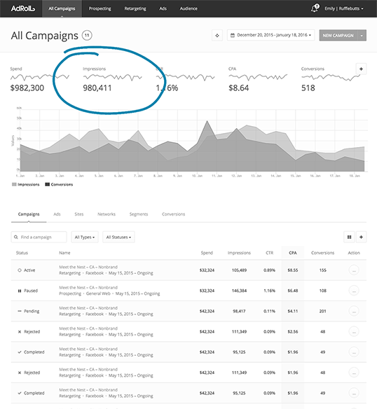
Marketers often reported that metrics on the old home were too broad for action: "That 980,411 - I don't have any thoughts about it. It’s just a big number. The value of this UI will be in giving very tailored use-case metrics, like whether we've made improvements to our ad copy."
— Mid-Market Customer
Design for Outcome
Surfacing Top Contributors
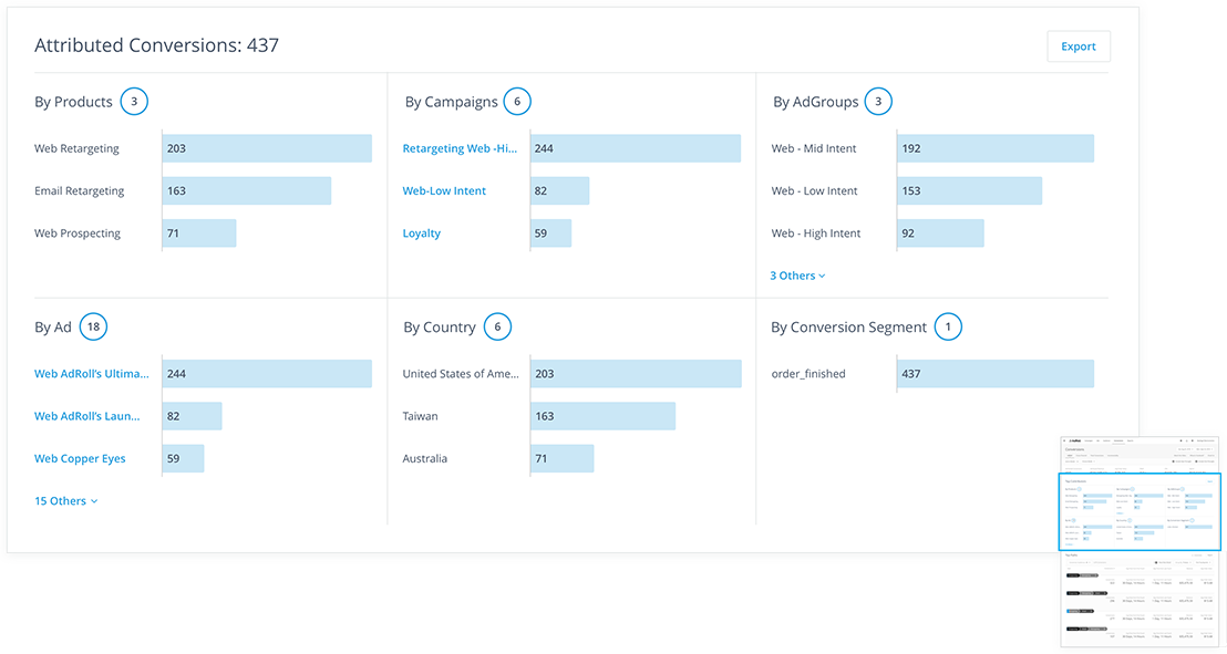
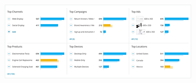
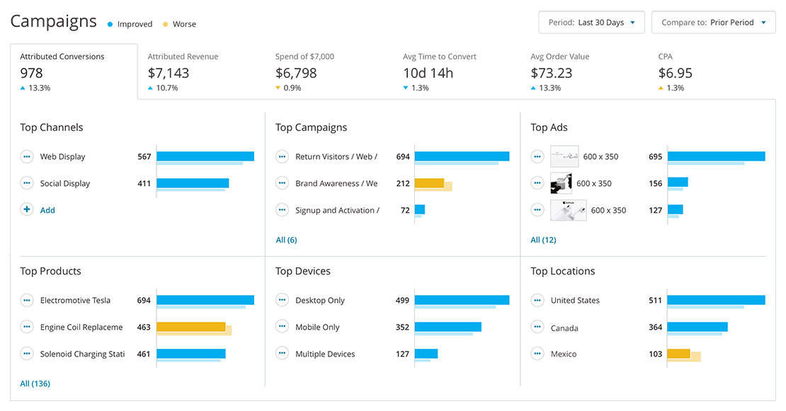
The product team was initially too busy to prioritize design updates to the home page. However, other teams I supported were trying new solutions elsewhere. This "Top Contributors" idea sliced conversions by several dimensions. The more granular presentation was intended to relieve the marketer from hunting for the top drivers of performance.
Measure the Impact
A Good Start
After the Top Contributors solution shipped, I tracked first-time and return visits in Heap. It was promising to see that more than half our visitors were consistently returning, but it still wasn't clear if the information was valuable enough to promote to the Campaigns Home.
Discoverable
0%
Total Monthly Visits
High Value
0%
Return Visits
Understand the Person
Determining Priorities
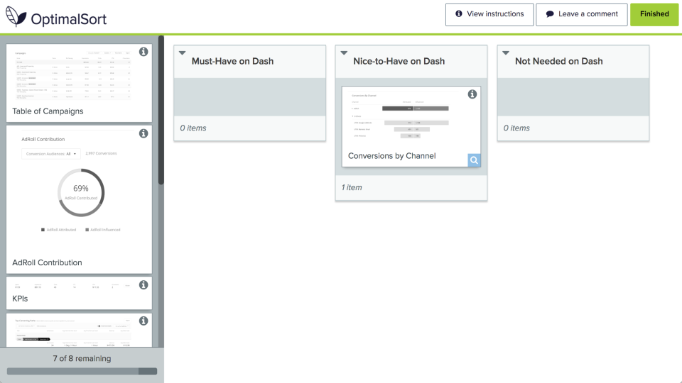
After seeing our success metrics, the Home team was more receptive to prioritizing updates. But no one was sure which cards to add or whether they should append or replace the old content. I needed a way to understand customer Must-Haves for the Campaigns Home.
Understand the Person
Card Sorting By Priority
I organized an online card sort that allowed 8 customers to drag randomized cards into one of three buckets. Those cards most-often sorted into the Must-Have bucket would be promoted to the Home page. Customers also provided comments for improving cards.
Understand the Person
The Winners
Key Performance Indicators

Despite the sentiment of being too over-summarized, KPIs were still deemed indespensible for setting the context of the page.
"I prefer KPIs as first thing so I know how everything is doing. Based on that, I’ll dig a little deeper. — Small-Business Customer"
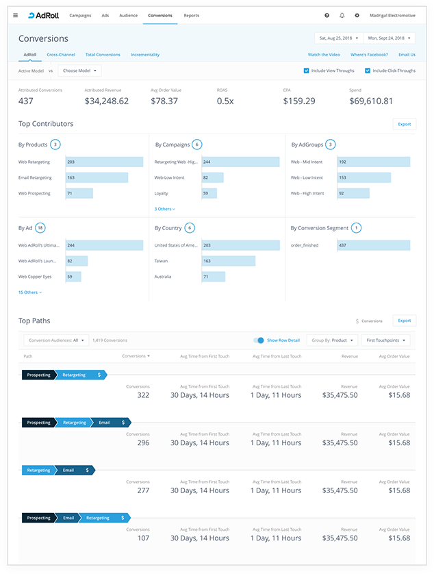
Top Contributors
Top Contributors was a surprise newcomer that replaced the line chart as more readable and actionable.
"...You can optimize. If you see Desktop resulted in Revenue you could tailor things more for Desktop. — Small-Business Customer”
Tables
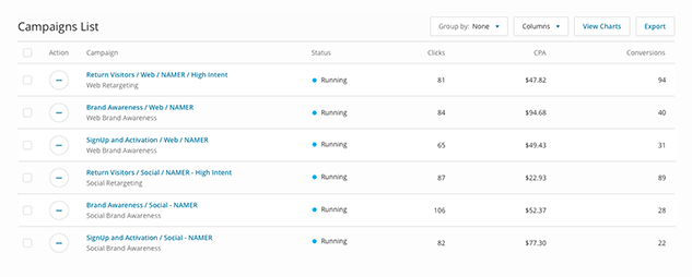
Tables were unanimously must-have as much for their granularity as their communicability.
“They're the quickest way I can show value to someone without marketing experience. — Small-Business Customer”
Understand the Person
Customer-Led Enhancements
Since we probed for comments during the card sort, several design enhancements were suggested to make the Top Contributors card more actionable. Selectable KPIs would allow customers to view top-drivers by any metric. And Compare To's enabled any bar value to be compared against itself from the Prior Period.
Putting It All Together
We were unable to fully ship before the company experienced a large turnover in leadership and the Campaigns Home team was dispersed. Nevertheless, my methods and approach ultimately enabled me to improve the design and convinced the team to build it.
AdRoll Design System
The company was in the midst of doing a rewrite of their existing campaigns dashboard. We used this opportunity to create a new design system that would align product designers, centralize our front-end technology, and inform emerging product lines.
View
Mic Check
This was a passion project I designed and built for iOS. It aggregates the concerts happening in my San Francisco neighborhood and previews video of the artists' past shows.
View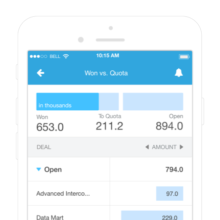
Salesforce Mobile Reports
Salespeople already had phone access to their business reports, but making them informative and enjoyable on small surfaces required knowing exactly the features to keep versus those to cut.
View