Salesforce Mobile Reports
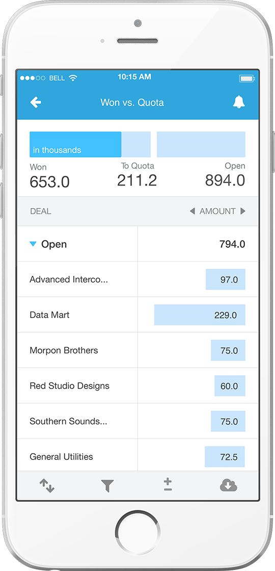
Salespeople already had phone access to their business reports, but making them informative and enjoyable on small surfaces required knowing exactly the features to keep versus those to cut.
About This Project
Salesforce.com needed a simple and powerful ways to make their desktop reports enjoyable and informative to read on phone screens.
My Role
- Design Lead:
- Concept Design /
- Information Design /
- Interaction Design /
- Pattern Design /
Deliverables
- Storyboards /
- Wireframes /
- Omnigraffle Mockups /
- HTML Prototype
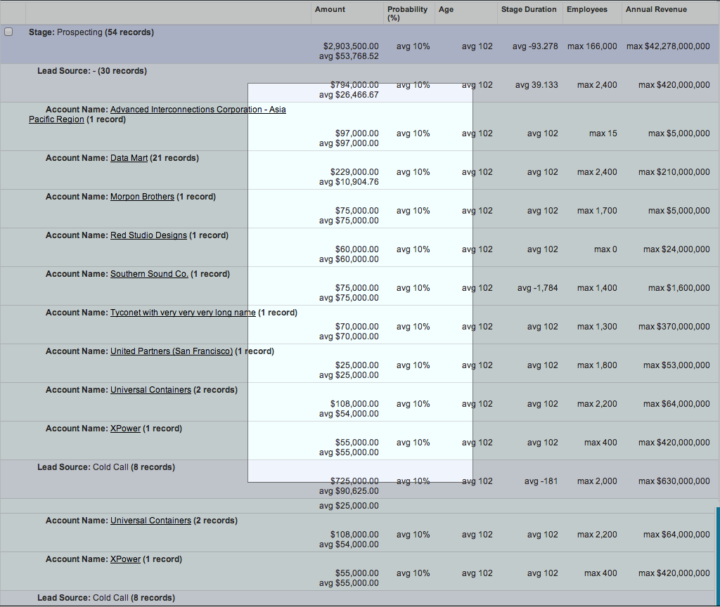
The Keyhole Effect
How could complex desktop reports be easily read and understood on mobile?
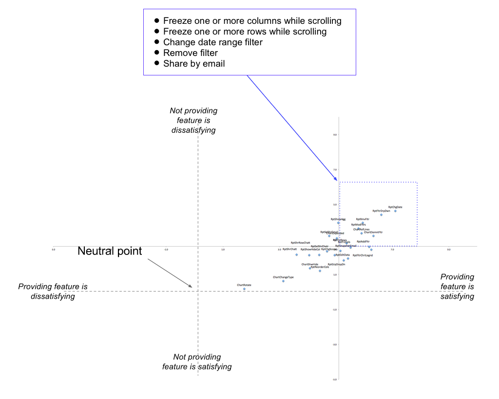
Kano Analysis
Steve Fadden used Kano Analysis to plot the highest-priority mobile features.
Sticking to Principle
Knowing the features to include – or exclude – enabled real estate to be utilized as efficiently as possible.
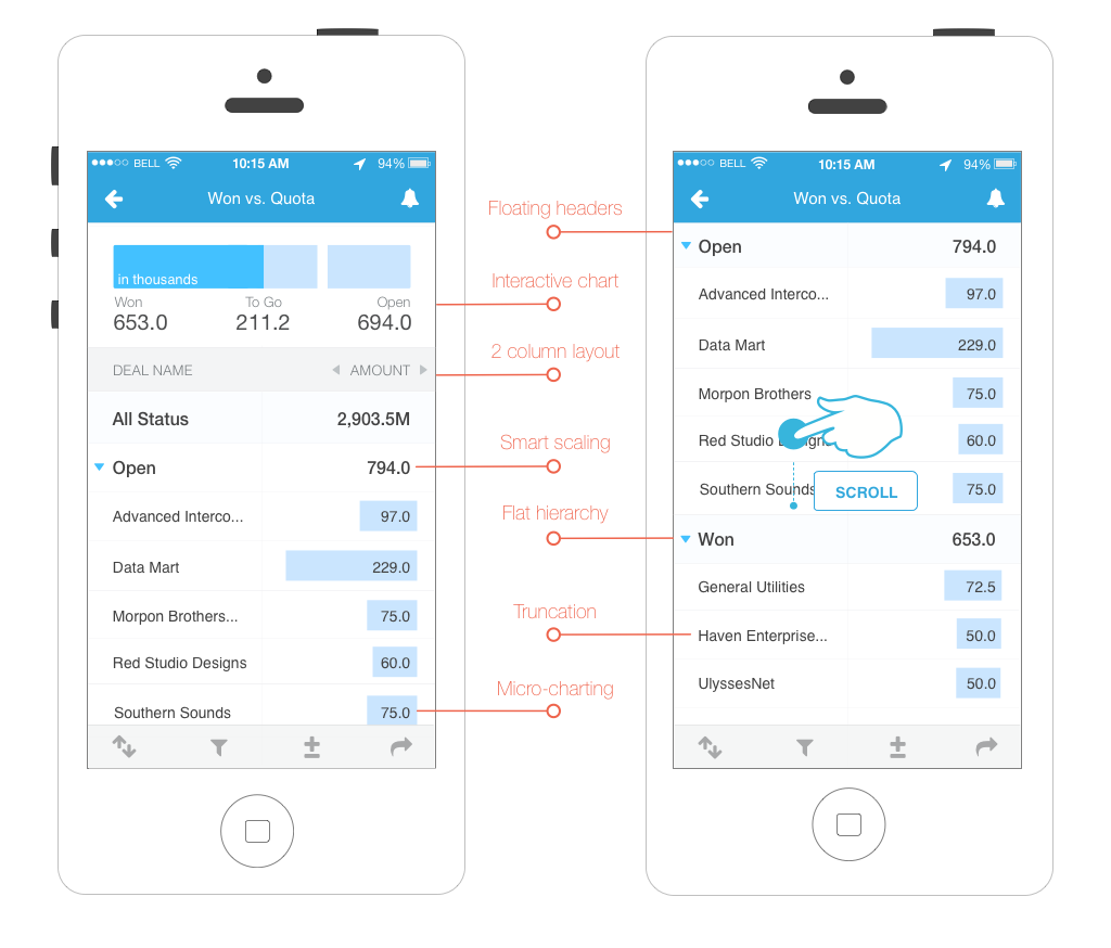
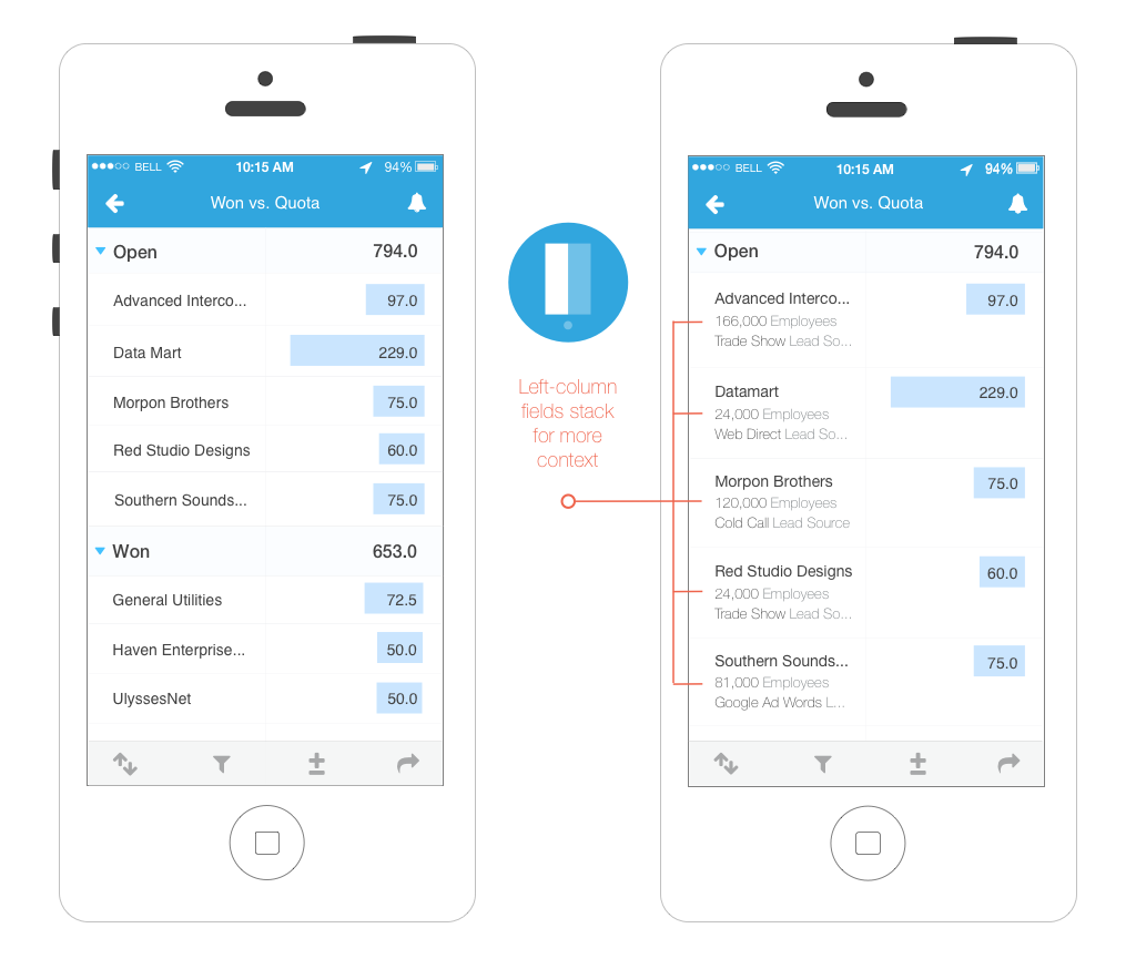
Left Column
We kept the left side fixed during horizontal scroll, even allowing fields to stack if this context was needed.
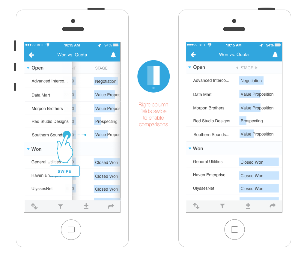
Right Column
This side scrolled horizontally, relying on swipe to advance adjacent columns discretely.
Other Work
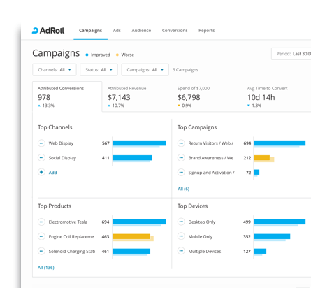
Campaigns Home
There were persistent problems with our dashboards not surfacing actionable content. I created a research and design process for allowing customers to prioritize which content would most compel them to act.
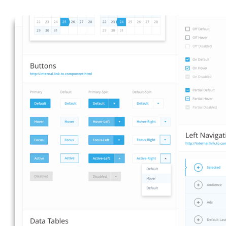
ViewAdRoll Design System
The company was in the midst of doing a rewrite of their existing campaigns dashboard. We used this opportunity to create a new design system that would align product designers, centralize our front-end technology, and inform emerging product lines.
ViewMic Check
This was a passion project I designed and built for iOS. It aggregates the concerts happening in my San Francisco neighborhood and previews video of the artists' past shows.
View

